Course project · Image Processing and Computer Vision · Saarland University
Classical image processing in modern C++
How can classical image-processing algorithms be implemented clearly in modern C++ and made visually understandable?
- C++20
- CMake
- Image Processing
A visual tour of classical image processing
Classical image processing is a large toolbox of algorithms for changing, filtering, and measuring images: brightening a dim photo, sharpening edges, erasing periodic noise, estimating the motion between two frames, recovering depth from a stereo pair, or splitting a picture into regions. This page walks through about twenty of them, grouped by what they do, each shown on a real image you can explore.
- Intensity and color change individual pixel values, or how finely color is stored.
- Transforms and filtering work in terms of scales and frequencies, to blur, sharpen, denoise, or compress.
- Features and geometry turn local measurements into edges, corners, lines, motion, depth, and regions.
Every algorithm here is written from scratch in C++20, with no image-processing library doing the real work, just the standard library and a small shared foundation (an image type, reflected image borders, convolution, and the Fourier transform). Every figure is genuine output from that code; drag the slider, or move it with the keyboard, to compare two settings.[01]01Hohman et al. (2020), “Communicating with Interactive Articles,” Distill.
Intensity and color
These operations do not try to find objects in the image. They change how pixel values are represented, spread out, or split into separate brightness and color.
Quantization
Quantization reduces the number of distinct brightness levels an image uses. Keeping $b$ bits leaves $2^b$ levels, evenly spaced a bin width $\Delta$ apart:
\[ \Delta = 2^{8-b} \]Each pixel is then rounded to the middle of whichever bin it falls into:
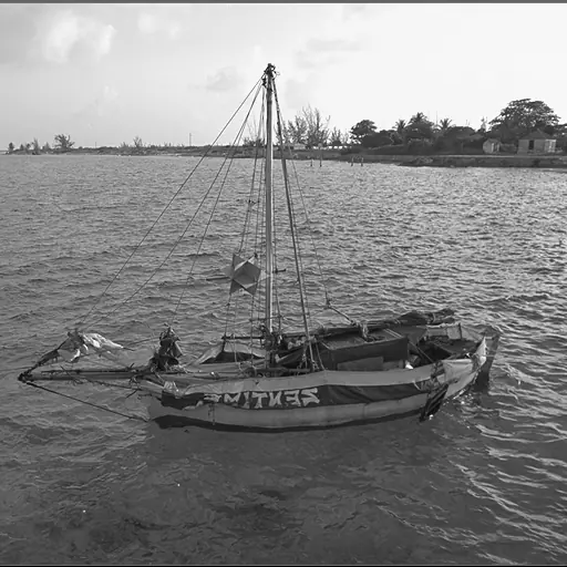
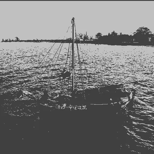
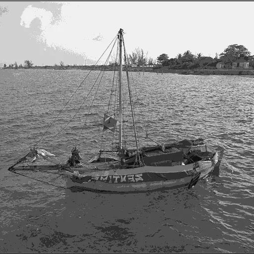
\[ q(x)=\Delta\left(\left\lfloor\frac{x}{\Delta}\right\rfloor+\frac12\right). \]Here $x$ is the original 0–255 value and $q(x)$ its quantized version; a smaller $b$ means fewer bins, a larger $\Delta$, and bigger jumps between levels. Every pixel is handled on its own, with no neighbors involved, but because nearby pixels in a smooth gradient often fall in the same bin, they all snap to the same level, which is why gentle gradients turn into flat bands. At one bit only two levels survive and most of the image goes flat; three bits keep eight levels, enough to recognize shapes but with visible banding; six bits keep 64 and look close to the original.
Loading image comparison…
Original
1 bit
Dithered quantization
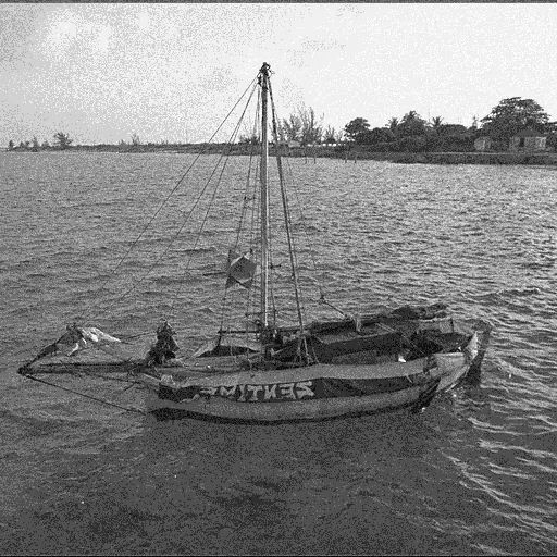
Dithering hides that banding by adding a little random noise to each pixel before quantizing. The noise nudges neighboring pixels across bin boundaries, so instead of one hard band you get a fine, grainy texture that the eye blends back into the in-between shades that were lost. No new levels are created; a three-bit dithered image still uses only eight. The improvement is entirely in how those levels are arranged across the image.
Loading image comparison…
Plain 3-bit
Dithered 3-bit
Gamma correction
Gamma correction adjusts overall brightness with a single dial. Each pixel is remapped on its own:
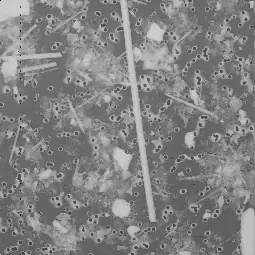
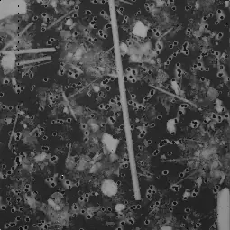
\[ x' = 255\left(\frac{x}{255}\right)^{1/\gamma}. \]The value $x$ is first scaled to the 0–1 range, raised to the power $1/\gamma$, and scaled back to 0–255. The single parameter $\gamma$ sets the shape of the curve: at $\gamma=1$ the exponent is 1 and nothing changes; $\gamma<1$ raises each pixel to a power above 1, which pulls mid-tones down and darkens the image; $\gamma>1$ does the opposite and brightens them. Because the mapping is a curve rather than a straight line, it moves the mid-tones the most and leaves pure black and pure white almost fixed.
That makes gamma useful when a photo is simply too dark or too bright but its detail is otherwise fine. It cannot invent detail, though: pushed too far, bright areas flatten toward white or shadows collapse toward black.
Loading image comparison…
Original
γ = 0.5
Histogram equalization
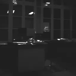
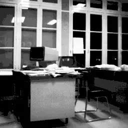
Where gamma applies a fixed curve you choose, histogram equalization builds the curve automatically from the image itself, aiming to spread the brightness values as evenly as possible across the full range. If a photo only uses a narrow band of dark grays, equalization stretches that band so it fills black to white, pulling hidden contrast into view.
It works from the image’s histogram, a count of how many pixels have each brightness. The running total of that histogram (its cumulative count) becomes the map from old value to new:
hist[v]      = number of pixels with brightness v          (v = 0 … 255)
cdf[v]       = hist[0] + hist[1] + … + hist[v]              (running total)
new_value(v) = round( 255 × (cdf[v] − cdf_min) / (total_pixels − cdf_min) )
Because the map stretches where pixels are crowded and compresses where they are sparse, the busiest brightness ranges get spread apart, exactly where detail was hidden. The trade-off is that one single mapping is applied to the whole image, so a bright patch in one corner can shift the grays everywhere, and faint noise in a thinly-used range can be amplified into view.
Loading image comparison…
Original
Equalized
The histogram makes that redistribution explicit. The algorithm still uses all 256 gray levels; the chart groups them into four-level bars for readability. Select an image, then hover over a bar to inspect its intensity range and pixel count.
Loading interactive chart…
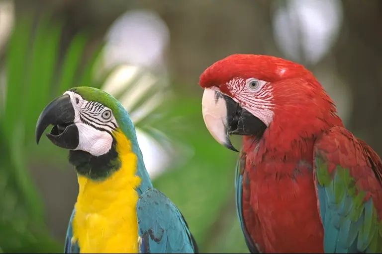
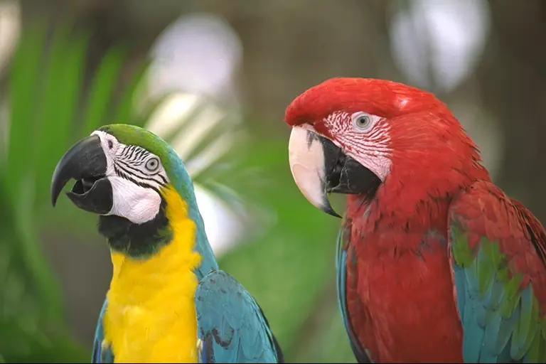
Chroma subsampling
In an RGB image, brightness and color are tangled together across all three channels. Chroma subsampling untangles them: it converts the image to YCbCr, which stores brightness on its own ($Y$) separately from the two color channels (Cb and Cr). Brightness is kept at full resolution, while the color channels are blurred by averaging them over $f \times f$ blocks of pixels, before everything is converted back to RGB.
The block size $f$ sets how much color detail is thrown away: at $f = 2$ one color value covers a $2 \times 2$ patch (four pixels), and at $f = 8$ it covers 64. As $f$ grows, fine color boundaries smear together, yet the picture still looks sharp, because the eye takes most of its sense of detail from brightness, which is left untouched. That is exactly why photo and video formats store color at lower resolution than brightness to save space.
Loading image comparison…
Original RGB
Factor 2
Transforms and filtering
These methods stop looking at the image pixel by pixel and instead describe it in terms of patterns: how much of each frequency it contains. Once an image is written that way, you can filter it: keep some patterns and suppress others to blur, sharpen, remove repeating noise, or compress.
Fourier spectrum
Any image can be rebuilt by adding together simple wave patterns, the light-and-dark ripples of different spacings and directions. The Fourier transform finds that recipe: for each possible wave it measures how much of it the image contains. Slow, gentle ripples account for broad areas of tone, and fast, tight ripples account for fine detail and sharp edges.
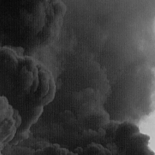
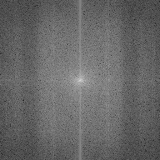
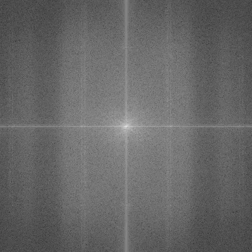
The result is drawn as a spectrum, with the lowest frequency in the middle and higher frequencies further out. That central low-frequency value dwarfs the rest, often by thousands of times, so the display takes a logarithm first; otherwise only the center would show:
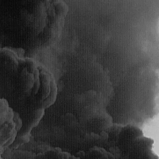
\[ \log\left(1+\lvert F(u,v)\rvert\right). \]$F(u,v)$ measures how much of the wave at frequency $(u,v)$ the image contains. Read the spectrum like a map: brightness shows how strong a wave is, the farther a point sits from the center the finer its ripple, and a bright streak points across the edges that produced it. The two examples make this concrete. The soft, smoothly shaded smoke packs nearly all its energy into a bright blob at the center, because it is mostly slow variation, while the sharp-edged fire throws a bright streak across the spectrum at right angles to those edges.
Loading image comparison…
Spatial image
Log spectrum
Notch filtering
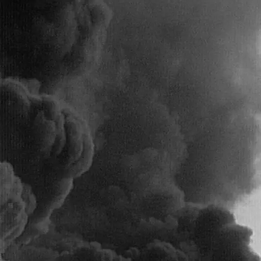
This is where the frequency view earns its keep. Suppose a photo is spoiled by a regular, repeating ripple, like the vertical stripes in the example. In the image itself those stripes run through everything, tangled up with the real content, so there is no one place to erase them. But a repeating ripple is a single wave, so in the spectrum it collapses to a single bright spot (a symmetric pair of spots, since the spectrum is mirror-imaged). Interference that was smeared across the whole picture becomes one tidy target.
Loading image comparison…
Periodic noise
Fourier spectrum
A notch filter uses exactly that. It erases a small circle around the offending spot (and its mirror), then transforms back to an ordinary image. Because only that one wave was taken out, the stripes disappear while the rest of the picture is left almost untouched. That would be very hard to do by editing pixels directly, where the stripes are everywhere at once.
The single control is the radius of the erased circle. A small radius is surgical but can leave faint stripes behind; a larger radius removes the interference more completely, but starts taking nearby real detail with it.
Loading image comparison…
Periodic noise
Radius 1
Block DCT approximation
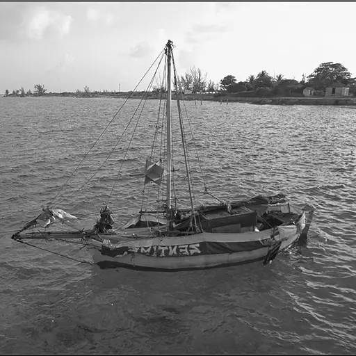
JPEG rests on a simple observation: up close, most of an image is fairly smooth, so a small patch can be described with a few broad strokes and only a little fine detail. The discrete cosine transform (DCT) makes that precise. It cuts the image into small $8\times8$ tiles and, for each tile, asks how strongly it resembles each of 64 fixed patterns: a flat gray, then gentle gradients, then ever finer ripples, down to a tight checkerboard. The 64 answers are the tile’s DCT: a weight for each pattern, and adding the patterns back in those amounts reproduces the tile exactly.
For a typical tile the smooth patterns carry almost all the weight and the fine ones carry very little. The view below shows those weights (on a log scale, so the small ones stay visible); the bright upper-left corner of every tile is where the important low-frequency weights sit.
Loading image comparison…
Spatial image
Block coefficients
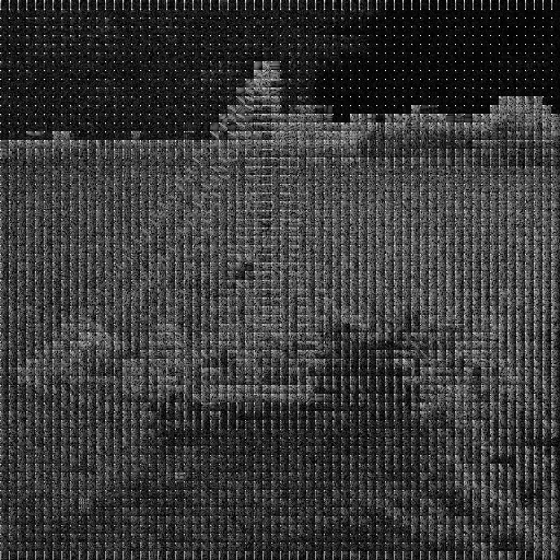
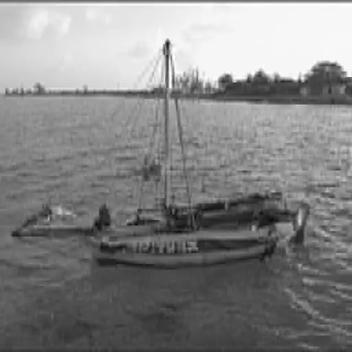
Compression is then just discarding the weights that barely matter. Keep only the few largest per tile and the broad shapes survive, but texture is lost and the tile grid starts to show; keep more and the detail returns. This is only the heart of JPEG; the full format adds several more steps. But it is the step that does the actual squeezing.
Loading image comparison…
Original
Keep 5%
Haar shrinkage
The Haar transform is the simplest wavelet, and its whole idea is averages and differences. Walk along a row two pixels at a time and store, for each pair, their average and their difference. The averages form a half-size, blurrier copy of the row; the differences record the fine detail that copy left out. Do the same down the columns, then repeat the whole step on the shrunken copy, and again. Each round peels off one more, coarser layer of detail and leaves an ever-smaller thumbnail behind.
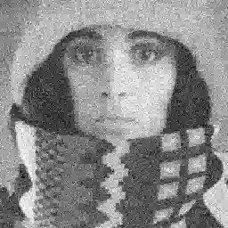
Why bother? Because noise and real structure separate cleanly in those difference values. Random noise is scattered everywhere and shows up as many tiny differences, while a real edge shows up as a few large ones. So if you set the small differences to zero and rebuild the image from what remains, you erase most of the noise while keeping the edges.
Three rules decide what counts as “small”, using a cutoff $T$ applied to each detail value $c$:
- Hard: zero out anything with $\lvert c\rvert\leq T$ and leave the rest untouched. Sharp, but the abrupt cutoff can leave artifacts.
- Soft: $\operatorname{sign}(c)\max(\lvert c\rvert-T,0)$ shrinks everything toward zero by $T$, which is smoother but dims real detail too.
- Garrote: $c(1-T^2/c^2)$ above $T$, a compromise that leaves large values nearly alone while still suppressing small ones.
Raising $T$ removes more noise but also more genuine detail; the three rules mainly differ in how gently they treat the values they keep.
Loading image comparison…
Noisy input
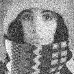
Hard threshold
Wiener deconvolution
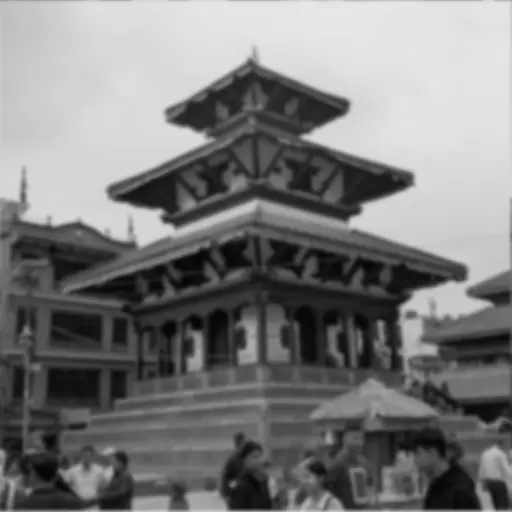
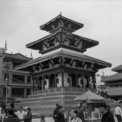
Blurring smears each point of a sharp image over its neighbors, and in the frequency domain that smearing becomes plain multiplication: the blurred image $G$ equals the sharp image $F$ times the blur’s frequency response $H$, plus some noise $N$; that is, $G=HF+N$. To undo it you would divide by $H$, but wherever the blur has almost wiped a frequency out, $H$ is nearly zero, and dividing by nearly zero explodes any noise there into wild ripples. Wiener deconvolution adds a safety term $K$ to the denominator to hold that in check:
\[ \widehat F(u,v)= \frac{H^*(u,v)} {\lvert H(u,v)\rvert^2+K}\,G(u,v). \]$H$ is the known blur and $G$ the blurred input; $\widehat F$ is the estimate of the sharp image; and $K$ is the one dial you turn. Set $K$ very small and it sharpens hard but lets noise erupt into ringing; set it large and it stays clean but leaves the image soft. The example lets you hunt for the sweet spot in between, where a little residual blur buys a lot less noise.
Loading image comparison…
Blurred input
K = 0.002
Gaussian smoothing
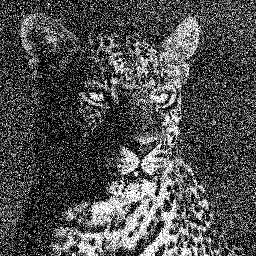
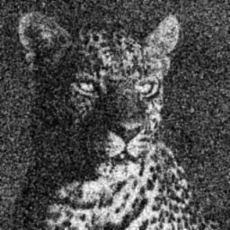
To blur an image gently, replace each pixel with an average of itself and its neighbors, weighting nearby pixels more than distant ones, following a bell curve of width $\sigma$:
\[ g_\sigma(t)=\frac{1}{Z} \exp\left(-\frac{t^2}{2\sigma^2}\right). \]$t$ is a pixel’s distance from the center of the bell, and $Z$ just rescales the weights so they add up to one, so the image does not get brighter or darker overall. The width $\sigma$ is the only setting, and it decides how large a neighborhood each pixel is mixed with: a small $\sigma$ blends only the closest pixels, smoothing away fine grain while edges survive, while a large $\sigma$ pulls in pixels from much further off and dissolves bigger and bigger features. In the example, the smallest setting merely cleans up noise while the largest turns the scene soft and shapeless.
Applying this bell across the whole image, sliding it over every pixel and taking the weighted average, is written $G_\sigma * f$. The $*$ is called convolution, and it recurs in the filters that follow. Seen in frequency terms, the Gaussian is a low-pass filter: it keeps the slow variations and drops the fast ones, which is why it also underpins the high-pass and band-pass filters below.
Loading image comparison…
Original
σ = 0.8
High-pass filtering
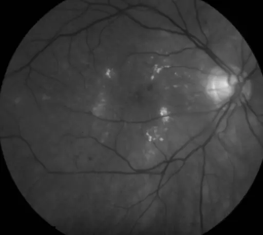
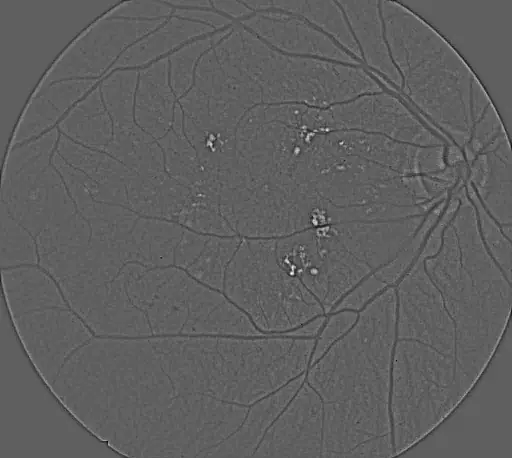
Turn that idea around. If a blur keeps only the slow variations, then subtracting the blur from the original leaves only the fast ones: the fine detail and edges the blur threw away. That is a high-pass filter:
\[ h_\sigma = f-G_\sigma*f. \]$f$ is the image and $G_\sigma*f$ its Gaussian blur, so the difference $h_\sigma$ is exactly what the blur removed. The blur width $\sigma$ sets the dividing line between “slow” and “fast”: a small $\sigma$ subtracts only a very slight blur, so just the finest structures remain, such as the thinnest vessels of the angiogram in the example; a larger $\sigma$ lets broader structures through as well.
The output is signed: on one side of an edge it comes out positive, on the other negative. So it is rescaled to a gray range for display, where mid-gray means “no response” and lighter or darker means a response of one sign or the other. It is a measurement, not a photograph, which is why it sits beside the original rather than replacing it.
Loading image comparison…
Original
High-pass response
Band-pass filtering
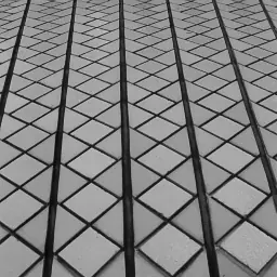
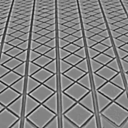
Between “keep the slow parts” and “keep the fast parts” sits “keep the parts in the middle”. A band-pass filter does that by subtracting two blurs of different widths, a difference of Gaussians:
\[ b_{\sigma_c,\sigma_f}=G_{\sigma_f}*f-G_{\sigma_c}*f, \qquad \sigma_c>\sigma_f. \]The finer blur $\sigma_f$ still holds the noise and everything coarser; the coarser blur $\sigma_c$ holds only the broad variation; subtracting the second from the first cancels both extremes and leaves the band of sizes in between. Bring the pair close together (say 1 and 2) to isolate fine texture, or spread them apart and larger (4 and 12) to pick out coarser patterns. The example sweeps through fine, middle, and coarse bands of the same tiled texture. As with the high-pass result the signed output is rescaled for display, so compare where and at what scale structures appear, not their absolute brightness.
Loading image comparison…
Original
Fine band
Unsharp masking
Sharpening is the mirror image of blurring: instead of removing fine detail, you find it and add more of it back. Unsharp masking blurs the image to a smooth version $s$, subtracts to get the detail the blur discarded ($f-s$, the same high-pass idea as above), and adds a multiple of that detail onto the original:
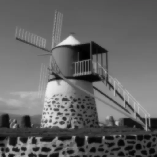
\[ f_{\text{sharp}}=f+a(f-s). \]$f$ is the original, $s$ its blurred version, and $a$ controls how much extra detail is poured back in. A small $a$ gently crisps the edges; a large $a$ exaggerates them, and because the method cannot tell wanted detail from noise or from the edge itself, too much produces the tell-tale bright and dark “halos” along strong boundaries and makes flat areas look gritty. The example pushes $a$ from a tasteful boost up to that over-sharpened extreme.
Loading image comparison…
Original
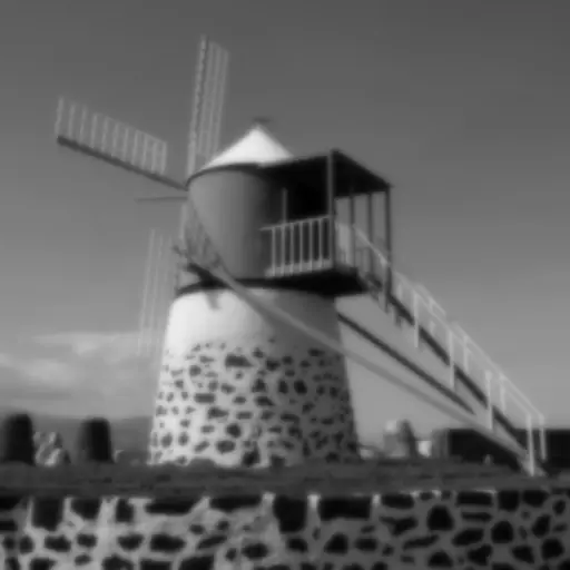
Amount 1
Features and geometry
The methods so far change how an image looks. The next ones measure it, turning local changes in brightness into maps of edges, corners, lines, motion, depth, and regions. Their outputs are not photos to admire but evidence to read.
Canny edge detection
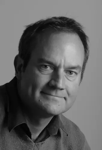
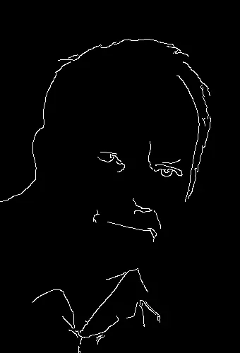
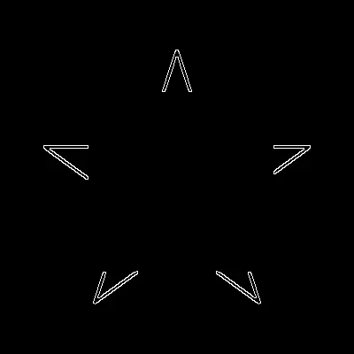
Canny is the classic recipe for turning an image into a clean set of edge lines.[02]02Canny (1986), “A Computational Approach to Edge Detection,” IEEE TPAMI. An edge is simply a place where brightness changes sharply, so the method starts by measuring how fast brightness changes at each pixel. It takes the horizontal and vertical slopes $f_x$ and $f_y$ (how quickly brightness rises going across, and going down) and combines them into a gradient with a strength and a direction:
\[ g = \sqrt{f_x^2 + f_y^2}, \qquad \theta = \operatorname{atan2}(f_y, f_x). \]Here $g$ is how strong the edge is at that pixel and $\theta$ is the direction it faces. Canny then cleans this up in three steps. It blurs the image first, by an amount $\sigma$, so that noise is not mistaken for edges. It thins each thick ridge of high $g$ down to a single-pixel line running along $\theta$. Finally it keeps a pixel only if its $g$ clears a high threshold, or clears a lower threshold while touching a pixel that already passed. That last two-threshold rule, called hysteresis, is what produces connected lines without letting noise leak in.
The blur amount $\sigma$ sets the scale of what counts as an edge. In the example, a small $\sigma$ keeps fine facial and background detail as edges, while a large $\sigma$ erases the small stuff and leaves only the bold outlines. Lowering the two thresholds admits more faint edges; raising them gives a sparser map.
Loading image comparison…
Original
Canny edges
Structure-tensor corners
An edge is a place where brightness changes fast in one direction. A corner changes fast in two directions at once, and the structure tensor is a compact way to test for that. At each pixel it builds a small 2×2 table from the gradients $f_x$ and $f_y$, then averages that table over a neighborhood:
\[ J=G_\rho * \begin{pmatrix} f_x^2 & f_xf_y\\ f_xf_y & f_y^2 \end{pmatrix}. \]The entries $f_x^2$ and $f_y^2$ measure how much brightness changes across and down, while $f_xf_y$ measures whether those two changes line up. The $G_\rho *$ in front is a convolution (the same sliding-window averaging as a Gaussian blur), which smooths the whole table over a neighborhood of size $\rho$ so the result describes a small patch rather than one pixel. Reading the two eigenvalues of $J$ then classifies the patch: both small means flat, one large means an edge (change in a single direction), and both large means a corner.
Two scales control the result. A smaller noise scale $\sigma$, used to smooth before the gradients are taken, keeps them crisp; a larger integration scale $\rho$ pools evidence over a wider patch, which finds corners more reliably but pins their location less precisely. The figure shows $\max(0,\det J)$, which stays bright only where both eigenvalues are large. In the example, the regular grids of window frames and building corners light up, while foliage gives a dense, scattered response.
Loading image comparison…
Original
Corner response
Mathematical morphology
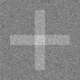
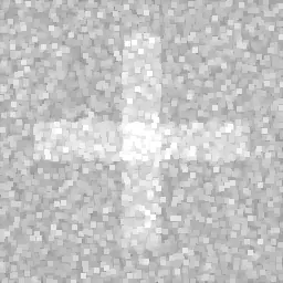
Where the filters so far averaged pixels, morphology works with the extremes inside a small window. Over a window of radius $r$ around each pixel, dilation takes the brightest value and erosion the darkest:
\[ (\delta f)(x) = \max_{\lvert s\rvert \le r} f(x+s), \qquad (\varepsilon f)(x) = \min_{\lvert s\rvert \le r} f(x+s). \]Here $f$ is the original grayscale image and $x$ a pixel, while $s$ ranges over the window. Dilation grows bright regions and swallows small dark specks; erosion does the reverse; and a larger radius $r$ makes both act on larger features.
On their own these two are blunt, but combining them in pairs gives the operations that are genuinely useful. Each one below is applied to the original image $f$:
- Opening erodes then dilates, removing bright specks too small for the window while leaving larger shapes intact.
- Closing dilates then erodes, filling small dark gaps and holes.
- White top-hat subtracts the opening from $f$, leaving just the small bright details the opening removed.
- Black top-hat subtracts $f$ from the closing, leaving the small dark details.
- Self-dual subtracts the opening from the closing, responding to small bright and dark structures at once.
Because each operation shows off best on different content, the example pairs every one with an image whose bright specks, dark gaps, or fine texture make its effect obvious.
Loading image comparison…
Original
Dilation
Hough line transform
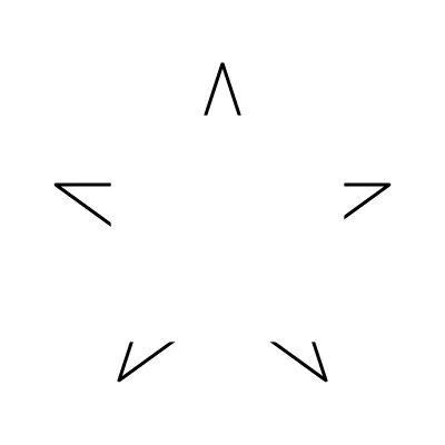
The Hough transform finds straight lines by letting the edge pixels vote. A single edge pixel could belong to many possible lines, so it adds a vote to every line that might pass through it. A real line collects votes from all the pixels lying along it, so it stands out as a peak in a table of candidate lines.
Each candidate line is described not by slope and intercept, which break down for vertical lines, but by its angle $\theta$ and its perpendicular distance $\rho$ from the image center $(x_c, y_c)$:
\[ \rho=(x-x_c)\cos\theta+(y-y_c)\sin\theta. \]For a given edge pixel $(x, y)$, this equation gives the $\rho$ of every line through it as $\theta$ sweeps around, and each of those $(\theta, \rho)$ cells collects a vote.[03]03Duda and Hart (1972), “Use of the Hough Transformation to Detect Lines and Curves in Pictures,” Communications of the ACM. After the strongest peaks are picked, a small area around each is cleared so one thick line is not reported several times over.
What you feed in matters as much as the transform. Clean, connected edges pile their votes onto the same few cells and give sharp peaks, while broken or noisy edges scatter the votes, which is why the noisier example is blurred more before edge detection. Two settings shape the output: how many peaks to draw (how many lines you want back), and how finely $\theta$ is divided (finer angles locate orientation more precisely but split the votes across more cells).
Loading image comparison…
Original
Canny input
Horn–Schunck optic flow
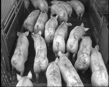
Optic flow estimates how each pixel moved between two frames. Horn–Schunck looks for the motion field $(u,v)$ that best balances two demands, that a point keeps its brightness as it moves and that neighboring pixels move similarly (a smooth field), by minimizing:
Loading image comparison…
Frame 1
Frame 2
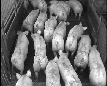
The first term is the brightness-constancy error: $f_x$, $f_y$, and $f_t$ are how fast brightness changes across, down, and over time, and the term stays small when the guessed motion $(u,v)$ accounts for the change from one frame to the next. On its own that is not enough, because a single pixel cannot reveal its own motion (a smooth wall looks the same however it slides sideways). The second term supplies the missing information by penalizing a jerky field, nudging each pixel’s motion toward the average of its neighbors.[04]04Horn and Schunck (1981), “Determining Optical Flow,” Artificial Intelligence. The weight $\alpha$ balances the two: a small $\alpha$ trusts the raw pixel evidence but comes out noisy, while a large $\alpha$ forces a smoother field that can bleed motion across real boundaries. The method reaches its answer by alternating between the two demands until the field settles.
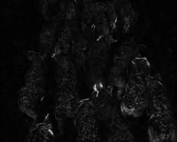
The figures show the amount of motion, $\sqrt{u^2+v^2}$ (brighter means more), not its direction, at three smoothness settings. Like most classical flow methods, it assumes small movements and roughly steady lighting.
Loading image comparison…
Reference frame
Flow magnitude
Correlation stereo
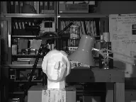
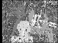
A stereo pair is two photos of the same scene from slightly different viewpoints. How far a point shifts between the two views (its disparity) tells you how close it is: nearer objects shift more, distant ones barely move. With the images lined up so matches sit on the same row, the method slides a small window from each left-image pixel along the right image and picks the shift where the two windows match best. The match score is a normalized cross-correlation, which ignores overall brightness and contrast differences between the two cameras, so it compares texture rather than exposure.
Loading image comparison…
Left image
Right image
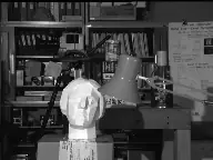
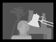
Two knobs matter. The maximum disparity sets how near an object can be and still be found. The window radius trades sharpness against reliability: a tiny $3\times3$ window keeps depth edges crisp but gets lost on blank, textureless areas, while an $11\times11$ window matches far more reliably but can straddle a foreground/background boundary and smear the depth across it.
The comparison below puts each estimate next to the true depth. Black is zero shift (far away) and white is the largest shift (nearest).
Loading image comparison…
Ground truth
Estimated disparity
Mumford–Shah-inspired region merging
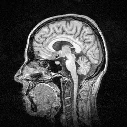
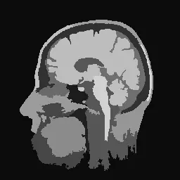
Segmentation splits an image into regions of similar color. This method starts with every pixel as its own region and repeatedly merges the two neighboring regions that are cheapest to merge, where the cost is
\[ \alpha_{ij}= \frac{\lvert\Omega_i\rvert\lvert\Omega_j\rvert (\mu_i-\mu_j)^2} {(\lvert\Omega_i\rvert+\lvert\Omega_j\rvert)\ell_{ij}}, \]$\mu_i$ and $\mu_j$ are the two regions’ average brightness, $\lvert\Omega_i\rvert$ and $\lvert\Omega_j\rvert$ their sizes, and $\ell_{ij}$ the length of the border they share. So two regions are cheap to merge when their brightness is similar, when they share a long border, or when one of them is small. The formula itself comes from the Mumford–Shah “cartoon” model, which favors an image made of a few flat regions.[05]05Mumford and Shah (1989), “Optimal Approximations by Piecewise Smooth Functions and Associated Variational Problems,” CPAM.
Merging keeps going until even the cheapest available merge costs more than a threshold, the maximum alpha. That threshold, not a target number of regions, is the control: a low value leaves many small regions, while a high one merges freely into a few broad areas. The sequence below shows fine texture merging away first, with the strongest boundaries surviving longest.
Loading image comparison…
Original
α = 10,000
How it all fits together
Under the surface, these methods share a handful of building blocks. Gaussian smoothing turns up almost everywhere: inside edge detection, the band filters, and as the first step of the corner and flow methods. The Fourier transform powers the spectrum, notch filtering, and deblurring. The same cosine and wavelet transforms that compress an image also let you measure exactly how much was lost. Seen together, the twenty-odd algorithms here are really a few core ideas (averaging, differencing, changing basis, and matching) recombined for different jobs.
Limitations
Every figure here is precomputed: the controls pick between saved results rather than running the code live or accepting your own uploads. The methods themselves are textbook versions with textbook limits: Haar needs square, power-of-two images; the optic flow has no coarse-to-fine step, so it only handles small motions; stereo ignores occlusions and sub-pixel depth; the DCT demo is not a full codec; and the segmentation is greedy. Several of the output maps are rescaled for display, so their grays show relative response rather than a real physical value.
Conclusion
Built from scratch in C++20, this collection turns a broad slice of classical image processing into something you can see rather than only read about. The point is less any single algorithm than the connections between them: how scale, frequency, local gradients, and region merging are variations on a few shared ideas, with each figure letting you watch a parameter change the result directly.